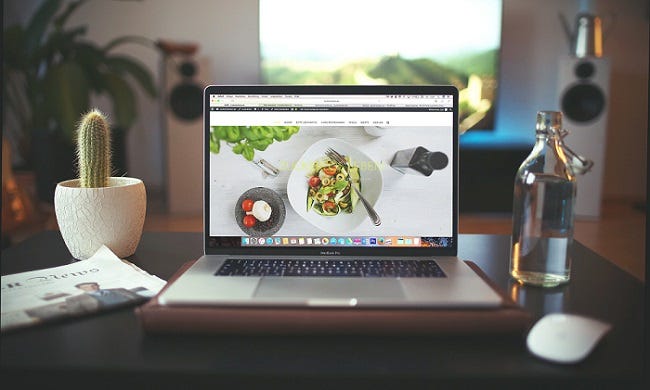
As the time passes by, people tend to prefer doing and getting to know everything through internet. That’s why, developing your business surely needs to be taken through internet as well. One of the efforts which you can do to spread awareness regarding your business to people is by building your own website. But it is such a shame that this matter hasn’t been taken seriously by small businesses in Australia as reported from ITnews, under 20 percent of medium-sized Australian businesses still don’t have a web presence, according to the Australian Bureau of Statistics.
Having well-designed website for your business should have been considered as an advantage since words take way more time for brain to process rather than nicely-made informative images. You must’ve experienced a situation where you’d choose to click an image which explains about a thing rather than reading a big chunk of paragraph. According to World of Learning, 90% of information transmitted to the brain is visual, and visuals are processed in the brain at 60,000 times the speed of text. That’s why, building a website which can be both informative and aesthetically pleasing is needed for sure to gain bigger traffic. To achieve that, here are some tips and trick for you to make your website look professional.
- Use readable font
Though sometimes eccentric fonts can be so interesting to look at, it would be such a hassle for some people to read. It is better for you to choose the simplest font for the main text and highlight the most informative part, like address, phone number, links and etc. Also, don’t forget to avoid using fonts which have significant differences in a page.
- Responsive design
You need to make sure the website you’re building is responsive and can be accessed through any type of device. Don’t put too much elements in a single page to avoid slow response while your website is being loaded. This will decrease your website’s traffic as people would immediately close your page for your website is loading too slow.
- Use intuitive navigator
Aesthetically pleasing design won’t give such a big impact to the visitor if you don’t use the right navigator. It is highly suggested for you to put the navigator on the top of the page to give visitors easy access to find the exact topic they are looking for. Designing a navigator that is hidden or hard to be reached by eyes is a big no since you’re not supposed to let the visitors wonder where and which button should they click.
Designing website is not an easy task indeed, that’s why you’re highly recommended to contact Website Design Gold Coast for their assistance to guide you on building your own website for your business.